If you've followed the Scribbles for a while, you'll know that every year in June, round about my birthday, I go to the Fine Art Degree Show at Loughborough Uni. Of course, there wasn't one last year because of covid, but I was delighted to see the show advertised again this year.
Obviously there were covid restrictions in place, which meant you had to book a time slot to attend, follow the one way systems, and read QR codes if you wanted to find out more about the individual artists, but it was SO nice to see what had been created by the very talented students after a year away.
It's difficult to credit the individual artists, as I only realised about the QR codes quite late on in my wanderings, so I hope they will forgive me for not saying who they are.
I wondered whether there would be a darkness to this year's show, following the pandemic, but was pleasantly surprised at the amount of colour and light on display. So...as usual, here are some of the things that really caught my eye. All the photos are from my phone this time, so I'm not sure how well they will show the pieces. Seeing a photo is never quite the same as seeing the real thing, but it'll give you an idea of what I found particularly interesting.
This incredible paper-folded sculpture seemed to writhe like a snake, suspended over your head. Always love to see some fabulous paperwork.
There were two obscured mirrors as part of this installation - I was struck as I looked at my refection in them how much of me was obscured, and yet I could clearly see my rainbow mask and the rainbow hearts on my t-shirt in the gaps...
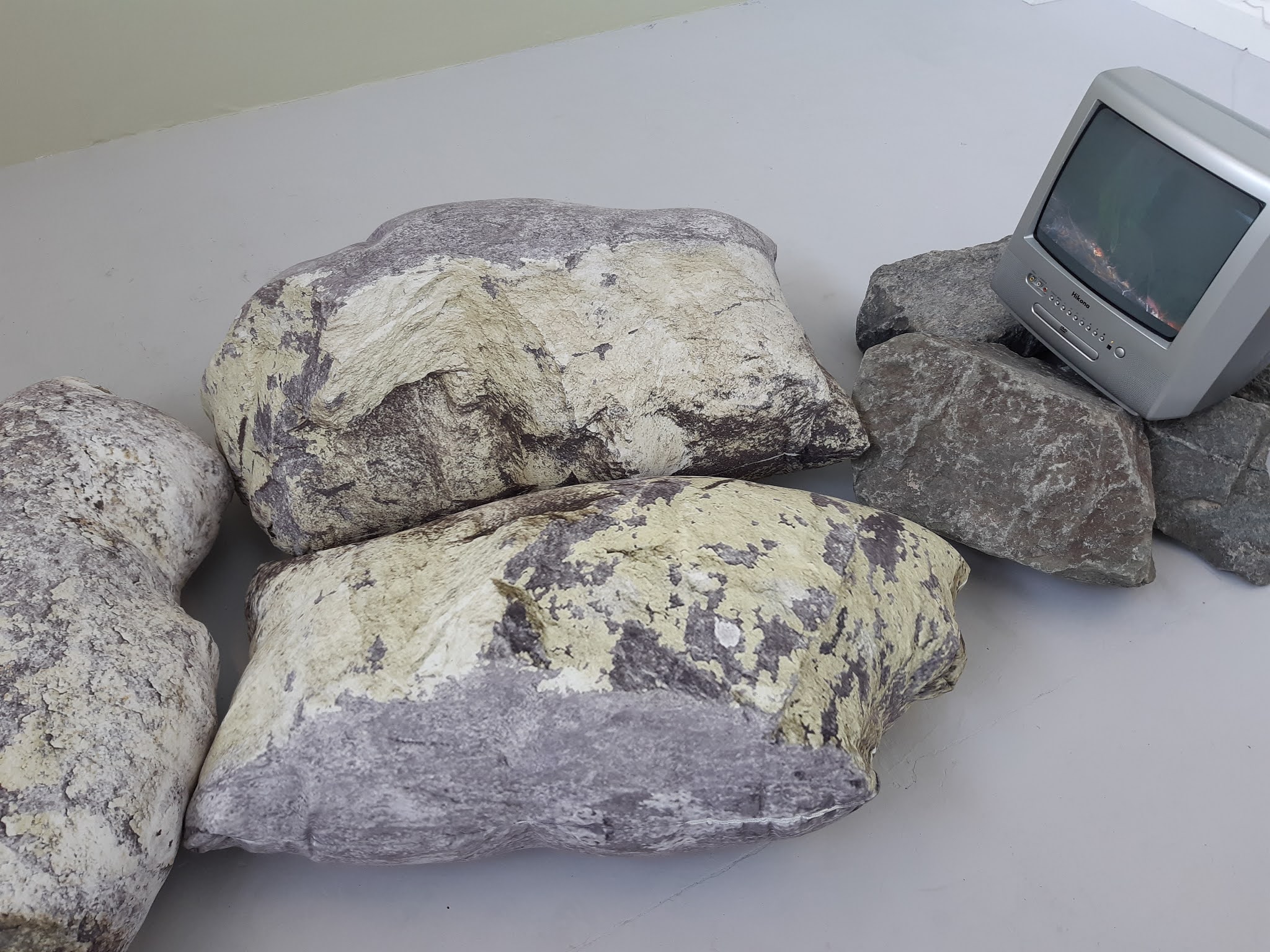
This one I loved - only the rocks under the telly are real. The large boulders are actually beanbags, printed with photographic images of lichen-covered rocks. The artist had managed to capture the irregularity of the rocks not just by the image, but how the beanbags were shaped, too.
Took this one for Mr Squidge, to show him how he could get creative with bike bits!
The textile prints are always gorgeous - and in this case, embellished with stunning pearl and diamante centre buttons which accentuated the print beautifully.
The colourways here were stunning - maroon with red and burnt orange. The collars are covered in 3D beaded and fabric flowers, and would be great to add to something plain.
These were like geometric stained glass and very textural. The colours aren't as vibrant as in reality, but I was impressed by the workmanship and the weaving techniques that held each sheet together.
There are always some amazing textiles and garments, and this photo really does not do the clothing justice. I loved the idea of 'melting' trousers - and the beadwork down each panel was exquisite. The blue jacket was quilted into contours, and had lots of blue beads and eye tokens sewn all over it. (The eye token is always blue and white, and I always associate it with Greece). What you can't see on the picture are the beads dripping off the fingers of those yellow gloves...
Again. the colours aren't so good in the photo, but the vibrancy of the orange and yellow against the green and blue just stood out for me.
This graphic design used one of my teenage heroes - Adam Ant - so I just had to take a pic...
This piece was in the most gorgeous earthy tones, with each square meticulously slow-stitched. It might be just running stitch, but I know there are hours of work on display here.
This artist must REALLY love pistachio nuts. I cannot bear to think how long it took to feed shells into the channels in the sheer fabric, or to drill holes in the shells and then string them with tiny clay beads to create another rather intriguing textile.
I'm always fascinated by beadwork, and this looked exceptionally real. Even the eyelashes are beaded, and the lids are sculptural rather than flat.
Last bit of beadwork - teeny tiny beaded spiders, sewn at intersections between the different fabrics.
The piece that had the biggest impact on me, I didn't take a photo of. To do so felt intrusive, as you'll probably realise when I describe it...
The piece was a portrait. An old man, and around the central portrait of his face were other, smaller studies of his folded hands...his nose...the bald patch on the top of his head...a closed eye... It was a fragments portrait and yet it was a whole. Then I realised one of the smaller studies wasn't of the man at all. It was of a brass plaque, with a name - Thomas - a date - December 2020 - and an age - 75 years.
That's when I realised that the siver grey background depicted in so many of the individual pieces was satin.
I was looking at a portrait of a dead person lying in their coffin.
It wasn't gruesome. I felt very much that it was a study of Thomas, painted with love, that made the viewer really take notice of the little things about the physicality of him as a person. I sat on the floor with it for a while, writing how it made me feel in the notebook left by the artist for that purpose.
There were two other pieces in the same installation. One was a picture of a skull, made from photoshopped images of some of Thomas's personal effects - his glasses, tablet box, false teeth and other items. On the wall opposite to the skull was a framed hospital incinerator bag, surrounded by images of items of clothing laid out on top of incinerator bags.
It was all very moving - sad and emotional because of the subject, but also uplifting in that the tribute to Thomas was evident in the meticulous paintings, even though one assumes his passing was not an easy event.
I do love the Art Degree Show...


No comments:
Post a Comment